Tuesday, 28 August 2012

T S Sullivant: A forgotten genius


Of all the comic artists I've discussed so far, most are well known. However, T S Sullivant seems to have been generally forgotten by most, perhaps with the exception of slightly geekier animators and illustrators like myself. I'm not too sure why this should be as the man was nothing short of a genius, possibly even an American equivalent of Tenniel or Grandville.


Sullivant lived from 1854 to 1926. An American, he was born in Columbus, Ohio. Some of his work would appear in the American satirical magazine, Puck, an equivalent of the British 'Punch' magazine. He was greatly influenced by AB Frost, a contemporary of his who worked in a similar style of using exaggerated forms. (I'll look at Frost in a future post, as his work is every bit as fine as Sullivant's). Like Frost, Sullivant was a master of pen and ink illustrations, using delicate cross hatching to render his figures and backgrounds.


Where Sullivant excelled was in his caricatures of animals. He was one of the first to really create a modern anthropomorphic look to his creatures - particularly his use of more rounded forms which would be emulated by animators at the Disney studio in particular in the 1920's and 1930's and later on by comic strip artists from Walt Kelly to Bill Watterson.


There's also a real attention to detail - despite the simplification of forms that Sullivant uses, the anatomy is still spot on. He also added a dynamism to his animals - compare this to a Tenniel from the 1870's which while competent seems staid and a little old fashioned (that isn't to degrade Tenniel - he too was a talented illustrator, just in a different way - I'll have a review of his work in a few weeks). He also seemed to pay close attention to movement, his animal characters seem animated - flowing with life and energy.

TS Sullivant


John Tenniel 
                                                                                                          From Alice In Wonderland


His human caricatures were also well observed, although perhaps some of the stereotypes are a little crude compared to today's more liberal minds.


Sullivant's work had a significant impact on many in the early American animation industry as well as on a number of comic artists, which makes his work all the more important to scholars of animation and comics history.

Until recently it was next to impossible to find any meaningful information on Sullivant, but through the dedication of a number of enthusiasts, a number of good articles have been written and many of his drawings have been reproduced on the web for future generations to enjoy. They're certainly going into my morgue file.

Biblography and further reading

http://animationresources.org/?p=718      - Good all round introduction to Sullivant's work with a number of links to blogs highlighting more of Sullivant's life.

http://andreasdeja.blogspot.co.uk/2011/06/t-s-sullivant.html  - Andreas Deja, an animator, who admits he's nuts about Sullivant and has posted a number of wonderful images, a few of which, I swiped for this article (sorry).

http://en.wikipedia.org/wiki/T._S._Sullivant  - Biography of Sullivant's life and some images.


Next along - Back to blighty - it's not 'Im.... but it is.... Ken Reid.

See you next week chums.

Friday, 17 August 2012

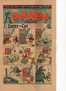
Farewell Dandy


So its true. After a few days of rumour and conjecture, DC Thompson have confirmed that the Dandy will close on its 75th anniversary, the 4th of December 2012. With sales having fallen to an average of 8,000 copies during the final six months of 2011 (the figures for the first half of 2012 are yet to be released, but I suspect that too will make for grim reading) it seems the writing is on the wall for this iconic comic.

The biggest blow is to all the writers, artists and designers who work on the comic - and in particular to the freelance contributors (who are not tied to DCT so if the work dries up - well that's one less client to work for). They may not number in the thousands or even the hundreds but its still a blow nonetheless to Britain's comic art community.

The greatest irony is that since it's 2010 relaunch, the publication has been one of the best things on the market with graphically brilliant strips, good gag writing and a real sense of anarchy - indeed it truly felt like a 2010's equivalent of the comic of the 1960s and 1970's, constantly pushing the boundaries of good taste and comic violence (which every children's comic should do in my view). It's a testament to the hard work that Editor, Craig Graham along with Jamie Smart and all the other writers, artists and designers, have put in to the comic to make it relevant and fresh for today's youth.

But sadly, it seems it's not to be. Low sales figures show that and despite what someone like me thinks, the vast majority of the public did not seem to agree and stopped buying the Dandy. It's not my nature to look for blame, it's likely a mixture of factors have combined over time from shop availability and presentation to the old evils of the TV, Computer Games and The Internet. It should be noted that the more conservative Beano still holds up with close to 40,000 copies sold every week, so perhaps kids prefer the older strips like Dennis The Menace after all.

The Dandy will move into a new realm in 2013, the digital domain. DCT promise some exciting things for the brand next year, but whether this translates into new strips and artwork or simply a Dandy portal with reprints and games, well we'll have to wait and see.

So for print at least, its Farewell Korky. Adios Dan, Goodbye Winker. Time to go to the great big press in the sky.


Tuesday, 7 August 2012

Anubis On The Road: Cover mock up


After a bit of planning, I've come up with the final idea for my cover for my small press comic, which I hope to have completed by the end of the summer. The intention is to create a sixteen page short story - so far eight pages down, eight to go. I decided to have a bit of a break from the main story and have a go at designing the cover. Rather than going down the road of inking and then colouring on a graphics program such as Photoshop, I felt it would be more interesting to try to hand colour and letter the cover to give it a bit more of a handmade look. This mock up should help in the positioning of elements as well as different line thickness to use to create a sense of depth to my work. I'm fairly happy with the result so I'll do some simple colour tests with markers and paints to judge what works best before working on the final cover.


That's all for now.
                                   

Animal Crackers at the Cartoon Museum

The Cartoon Museum in Bloomsbury, London has just opened a new exhibition looking at how cartoonists, animators and comic artists have depicted animals over the years. From greats such as Sir John Tenniel and Ronald Searle through to modern artists such as Steve Bell, Martin Rowson and Simon Tofield (of Simon's Cat fame), this is a fun filled exhibition for all the family with a veritable menagerie of animals and furry frolics.


The exhibition runs until the 21st October 2012 and entry is £5.50 for adults, £4 concessions, £3 for students and free to under 18s. Do come along.

More info

http://www.cartoonmuseum.org/


Bye for now.

Sunday, 5 August 2012

George Herriman and Krazy Kat

George Herriman is one of the other great influences on my work. His Krazy Kat strip which began in 1913 in the William Randolph Hearst newspaper, The New York Evening Journal, is citied by many as one of the most iconic comic strip in American history.

Herriman's style is simple, often scratchily drawn, yet his layouts were revolutionary - particularly his Sunday pages, which were also wonderfully coloured in ink and watercolour washes. It's no surprise then that the legacy of this strip is great. It won many intellectual fans through its deeper love triangle between Krazy, Ignatz Mouse (who constantly engages in hurling bricks at Krazy's head, though in the most loving manner) and Officer Pupp, who tries to prevent harm coming to Krazy by arresting and jailing Ignatz.
The above is a good example of how Herriman used innovative page layouts to add more to the stories and create a sense of dynamism.  He also used the strip to explore deeper philosophical issues such as those around love and existence, unusual for the time.

 This painting was drawn for a close friend of Herriman's and shows the main characters discussing Agathelan in Monument Valley in Arizona. Much of this landscape featured heavily in Herriman's Krazy Kat strips.
 His daily strips were also rendered beautifully in pen and ink.  This shows Don Kiyote, one of the lesser characters in the Krazy Kat kanon (sorry canon)


Among the strips admirers over time have included poet E.E Cummings, Chuck Jones (who borrowed heavily the desert backgrounds of Road Runner and Wile.E.Coyote from Herriman's Coconino County, Arizona setting), Bill Watterson (Calvin and Hobbes) and Charles Schulz (Peanuts).

Sources

http://www.old-coconino.com/sites_auteurs/herriman/bio/bio.htm

Really nice website of Herriman's work including a wide range of Krazy Kat strips

McDonnell,P, O Connell, K, de Havenon,G.R (1986) Krazy Kat: The Comic Art of George Herriman. Abrams, New York, New York.

One of the best books on Krazy Kat - a nice overview of Herriman's work from start to finish.

Marschall, R (1997) America's Great Comic Strip Artists: From The Yellow Kid to Peanuts. Stewart, Tabori and Chang, New York, New York.

Good introduction to Herriman's work along with other classic comic strip artists from America's golden age.

http://en.wikipedia.org/wiki/Krazy_Kat

Standard reference on Herriman.

That's all for this week